Dashboard style that makes you want to write (Bearblog)
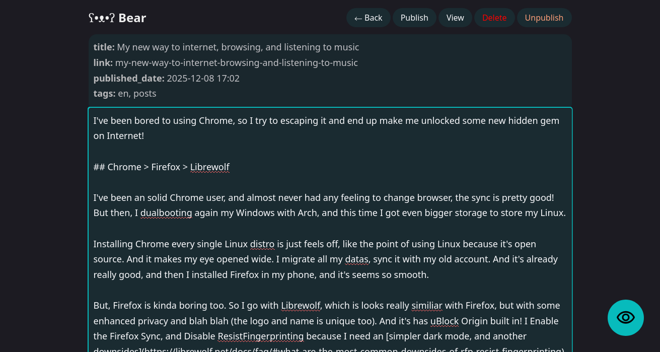
The default style for writing posts in Bearblog is simple, but not feels so modern or what. So, I tinkering a bit to the CSS, and this is the result.
- Device theming using
color-scheme - Buttons are placed at the top (>768px device)
- Attributes details are hidden
- A big preview button
- Make textareas resizing vertically
- A bit beautify
- Smooth animations
| Before | After |
|---|---|
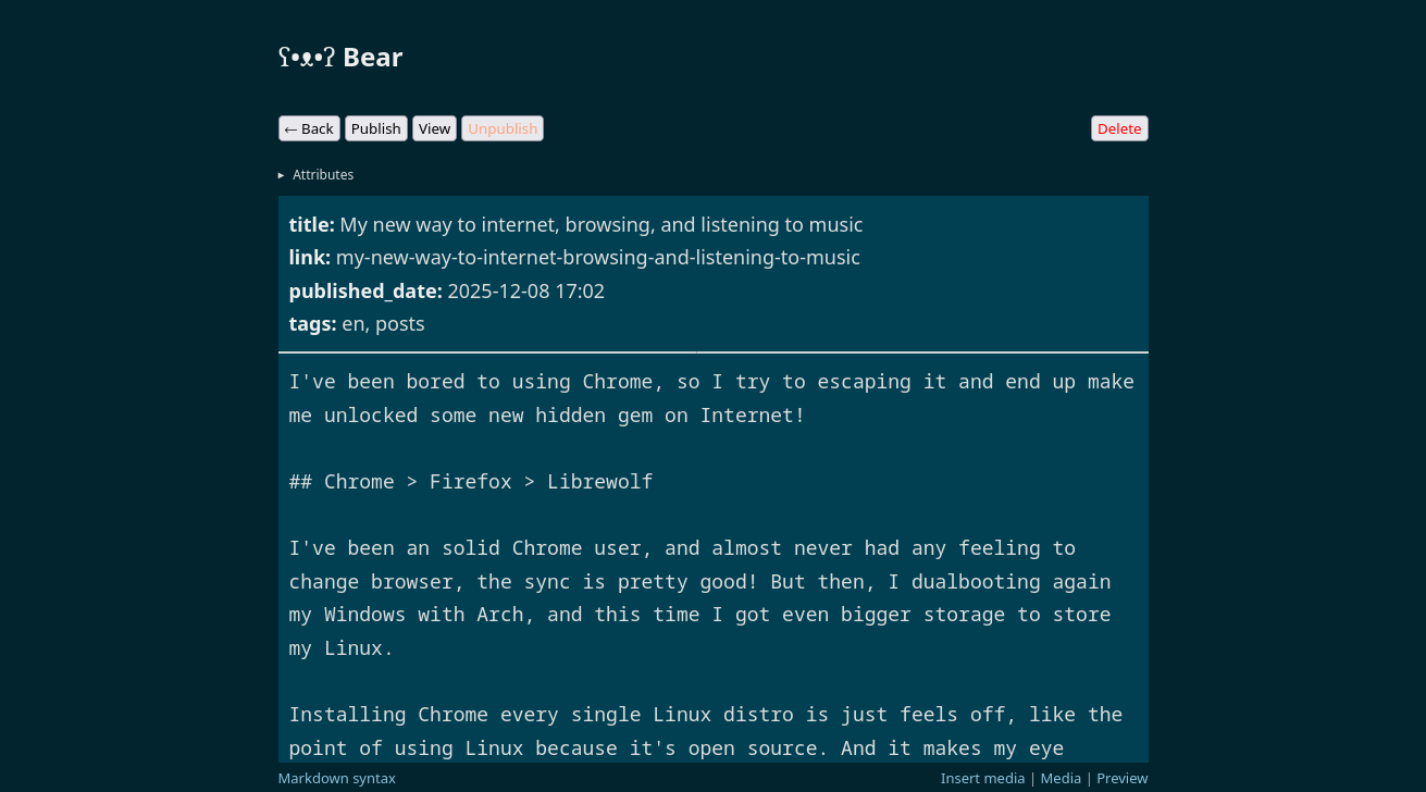 |
|
Feel free to use and modify it. You can apply it in this page, and paste the whole CSS code below to Dashboard styles.
Tip:
Change the--cvariable value in:rootto the hex color you liked. For example#7576ac.
/*
 * W3Teal | w3teal.bearblog.dev dashboard styles
 * Version 1.0.0 | 2025-12-14
 */

:root {
    color-scheme: light dark;
    --c: #07bbbc;
    --cs: color-mix(in srgb, var(--c) 10%, transparent);
    --cor-s: .25rem;
    --cor: 1rem;
    --width: 80% !important;
    --background-color: unset !important;
    --icon-preview: url("data:image/svg+xml,%3Csvg xmlns='http://www.w3.org/2000/svg' width='1em' height='1em' viewBox='0 0 24 24'%3E%3C!-- Icon from Material Symbols by Google - https://github.com/google/material-design-icons/blob/master/LICENSE --%3E%3Cpath fill='currentColor' d='M12 16q1.875 0 3.188-1.312T16.5 11.5t-1.312-3.187T12 7T8.813 8.313T7.5 11.5t1.313 3.188T12 16m0-1.8q-1.125 0-1.912-.788T9.3 11.5t.788-1.912T12 8.8t1.913.788t.787 1.912t-.787 1.913T12 14.2m0 4.8q-3.35 0-6.113-1.8t-4.362-4.75q-.125-.225-.187-.462t-.063-.488t.063-.488t.187-.462q1.6-2.95 4.363-4.75T12 4t6.113 1.8t4.362 4.75q.125.225.188.463t.062.487t-.062.488t-.188.462q-1.6 2.95-4.362 4.75T12 19m0-2q2.825 0 5.188-1.487T20.8 11.5q-1.25-2.525-3.613-4.012T12 6T6.813 7.488T3.2 11.5q1.25 2.525 3.613 4.013T12 17'/%3E%3C/svg%3E");
}

body {
    padding: 0 !important;
    position: relative;
    width: 60rem;
}

body,
#header_content,
#body_content {
    color: unset !important;
}

.sticky-controls {
    margin-top: 0;
}

@media (min-width: 768px) {
    .sticky-controls {
        display: flex;
        gap: .25rem;
        position: absolute !important;
        top: 0;
        right: 0;
        padding: 0px;
        margin: 16px 0;
    }
}

.sticky-controls+details:not(:hover) {
    display: none;
}

:is(#header_content, #body_content, textarea) {
    font-family: var(--font-main);
    background-color: var(--cs);
    transition: .25s;
    opacity: .75;
    border: none !important;
    resize: vertical;
}

:is(#header_content, #body_content, textarea):hover {
    opacity: 1;
}

:is(#header_content, #body_content, textarea):focus {
    box-shadow: 0 0 0 2px var(--c);
    opacity: 1;
}

textarea {
    border-radius: var(--cor);
}

#header_content {
    border-radius: var(--cor) var(--cor) var(--cor-s) var(--cor-s);
}

#body_content {
    margin-top: .25rem;
    border-radius: var(--cor-s) var(--cor-s) var(--cor) var(--cor);
}

button {
    color: #1d1d1d;
    color: var(--form-text);
    background-color: #efefef;
    background-color: var(--cs) !important;
    font-family: inherit;
    font-size: inherit;
    margin: 0 !important;
    padding: 8px 16px;
    border: none;
    border-radius: 2rem;
    transition: .25s;
    outline: none
}

button:hover,
#preview:hover {
    border-radius: .75rem;
}

#preview {
    position: fixed;
    bottom: 0;
    right: 0;
    margin: 2rem;
    background: var(--c);
    aspect-ratio: 1/1;
    border-radius: 2.5rem;
    transition: .25s;
    padding: 1rem;
    font-size: 0;
}

#preview::after {
    --size: 2.5rem;
    content: "";
    display: inline-block;
    width: var(--size);
    height: var(--size);
    mask-image: var(--icon-preview);
    mask-size: var(--size);
    background-color: #000;
}

.helptext.sticky {
    position: relative !important;
}